Data Visualization
Data Visualizaion - Pandas 기초 week2-2 실습 (part2)
Starters
2020. 9. 14. 16:19
ts = pd.Series(np.random.randn(1000), index=pd.date_range('1/1/2000', periods=1000))
print(np.sum(ts), np.mean(ts), np.std(ts))
ts
ts = ts.cumsum()   # cumsum() : 누적 합
print(ts)
ts.plot()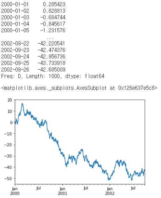
선 그래프
df = pd.DataFrame(np.random.randn(1000, 4), index=ts.index, columns=list('ABCD'))
df = df.cumsum()
plt.figure()
df.plot()

Bar Plot
df.iloc[5].plot(kind='bar');
# df.iloc[5].plot.bar()
df2.plot.bar(stacked=True);
히스토그램
df4 = pd.DataFrame({'a': np.random.randn(1000) + 1, 'b': np.random.randn(1000), 'c': np.random.randn(1000) - 1},
                   columns=['a', 'b', 'c'])
df4
plt.figure()
df4.plot.hist(alpha=0.5)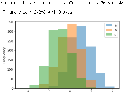
df4.plot.hist(stacked=True, bins=10)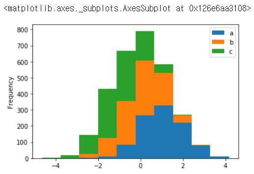
stacked=True 하면 그래프의 겹친 부분 합쳐짐
Box plot
# box, 수염, median 들에 색깔을 지정하려면
color = {'boxes': 'Blue', 'whiskers': 'DarkOrange',
         'medians': 'Cyan', 'caps': 'Gray'}

df.plot.box(color=color, grid=True, sym='r+')  # `sym` 키워드 : fliers(튀는 넘들, 나는 넘들, outliers)
                                    # 파이썬하면서 재미있게 살아요...
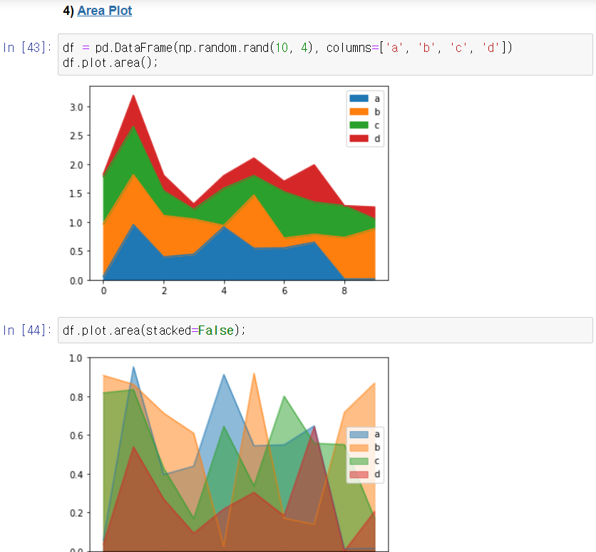
Area Plot
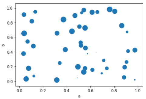
Scatter Plot
df.plot.scatter(x='a', y='b', s=df['c'] * 200); # s=df['c'] 에서 `s` 는 마커(원)의 크기