-
CSS - grid 이해하기CSS 2020. 9. 6. 00:35
flex와 grid의 가장 큰 차이점:
- flex는 1차원(한방향) 레이아웃 시스템, grid는 2차원(가로, 세로/ 두방향) 레이아웃 시스템
- grid가 더 복잡한 레이아웃 표현이 가능
IE에서도 지원하지만 방법이 다름
firefox사용하면 그리드 사용하기 더 편리하다고 한다.
<div class="container">
	<div class="item">1</div>
	<div class="item">2</div>
	<div class="item">3</div>
	<div class="item">4</div>
	<div class="item">5</div>
	<div class="item">6</div>
	<div class="item">7</div>
	<div class="item">8</div>
	<div class="item">9</div>
</div>
부모요소 Grid Container
자식요소 Grid Item
시작
부모요소에 display: grid;

1분 코딩, 2020년 02월 14일 수정, 2020년 09월 05일 접속, https://studiomeal.com/archives/533 Grid Track - grid의 행 또는 열
Grid Cell - grid의 한 칸 의미
Grid Line - gird 셀을 구분하는 선
Grid Number - Grid 라인의 각 번호
Grid Gap - gird 셀 사이의 간격
Grid Area - gird 셀의 집합
컨네이너에 적용하는 속성
display: grid;
display: inline-grid; // grid 전체를 inline-block처럼
그리드 형태 정의
grid-template-rows / grid-template-columns
(-ms-grid-rows / -ms-grid-columns)
repeat함수
.container {
grid-template-columns: repeat(5, 1fr);
/* grid-template-columns: 1fr 1fr 1fr 1fr 1fr */
}
-> repeat(반복횟수, 반복값)
minmax함수
최솟값 최대값 지정하는 함수
.container {
	grid-template-columns: repeat(3, 1fr);
	grid-template-rows: repeat(3, minmax(100px, auto));
}
-> 내용이 없어도 최소한 100px의 공간을 확보하고, 그 이상부터는 알아서 크기조정
auto-fill / auto-fit
auto-fill과 auto-fit은 column의 개수를 미리 정하지 않고
설정된 너비가 허용하는 한 최대한 셀을 채움

간격 만들기
row-gap / column-gap / gap
- 그리드 셀 사이의 간격 설정
.container {
	row-gap: 10px;
	column-gap: 20px;
}
=====================================================================
.container {
	gap: 10px 20px;
	/* row-gap: 10px; column-gap: 20px; */
}
=====================================================================
.container {
	gap: 20px;
	/* row-gap: 20px; column-gap: 20px; */
}
※ 브라우저 호환 범위를 넓이기 위해
grid-gap: 20px;
gap: 20px;
두가지 다 명시하기도 한다.
각 셀의 영역 지정

-ms-grid-row
-ms-grid-column
-ms-grid-row-span
-ms-grid-column-span
※ 숫자들은 각 Grid Line을 기준으로 하기 때문에 헷갈리면 안돼!
영역 이름으로 그리드를 정의

.container {
	grid-template-areas:
		"header header header"
		"   a    main    b   "
		"   .     .      .   "
		"footer footer footer";
}
※ 빈칸은 마침표 또는 “none”을 사용하면 되고, 마침표의 개수는 여러개를 써도 상관 없음

정렬
- 아이템들을 정렬, 컨테이너에 적용
세로축 정렬(align-items)
.container {
	align-items: stretch;
	/* align-items: start; */
	/* align-items: center; */
	/* align-items: end; */
}
stretch가 default
start 하면 세로로 상단에 각 아이템들 정렬
center는 중앙
end는 맨 밑으로 정렬
가로축 정렬(justify-items)
.container {
	justify-items: stretch;
	/* justify-items: start; */
	/* justify-items: center; */
	/* justify-items: end; */
}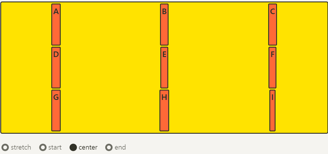
place-items
align-items와 justify-items를 같이 사용
.container {
	place-items: center start;
}
align-content (아이템 그룹을 세로 정렬)
- Grid 아이템들의 높이를 모두 합한 값이 Grid 컨테이너의 높이보다 작을 때
grid-item들을 모두 정렬
.container {
	align-content: stretch;
	/* align-content: start; */
	/* align-content: center; */
	/* align-content: end; */
	/* align-content: space-between; */
	/* align-content: space-around; */
	/* align-content: space-evenly; */
}
justify-content (아이템 그룹을 세로 정렬)
- Grid 아이템들의 너비를 모두 합한 값이 Grid 컨테이너의 높이보다 작을 때
grid-item들을 모두 정렬
.container {
	justify-content: stretch;
	/* justify-content: start; */
	/* justify-content: center; */
	/* justify-content: end; */
	/* justify-content: space-between; */
	/* justify-content: space-around; */
	/* justify-content: space-evenly; */
}

place-content
- align-content와 justify-content를 같이 사용
.container {
	place-content: space-between center;
}
align-self
- 개별 아이템을 세로로 정렬, 아이템에 적용
justify-self
- 개별 아이템을 가로로 정렬, 아이템에 적용
order
- 배치 순서를 결정, 각 아이템에 설정
- 시각적 순서만 바꿀뿐, HTML구조 자체를 바꾸는 것은 아님
z-index

※ IE 지원 위한 표

'CSS' 카테고리의 다른 글
CSS - 박스 테두리 따라 선 흐르는 애니메이션 (0) 2020.09.13 favicon - 웹사이트에 넣기 (0) 2020.09.07 CSS - 마우스 이미지 변경 (0) 2020.09.03 CSS + Jquery 이미지 페이드인 슬라이드 만들기 (0) 2020.09.03 CSS - grid 사용 정리 (0) 2020.09.03